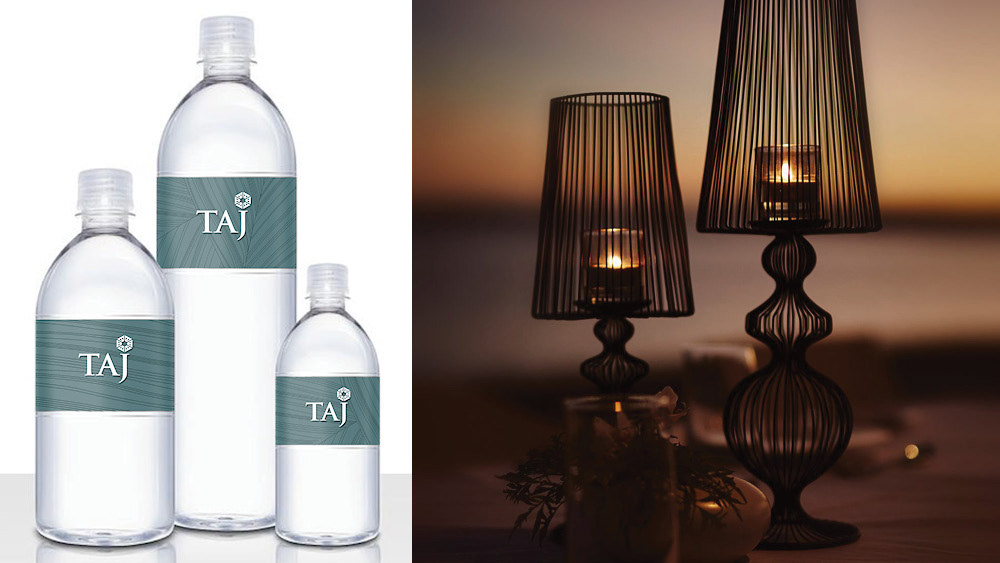
As the hotel is streamlining the Taj brand’s portfolio and bringing Vivanta By Taj - Hotels and Resorts and The Gateway Hotels and Resorts all under the one branded house, we can capitalize on the uniformity of the brand across collaterals. This will help keep printing costs quite economical, and will also help in making sure the brand is cohesive across each sub-brand (Hotels, Palaces, Resorts & Spas and Safaris). This design system will cover the majority of the collaterals using a white and gold colour scheme.
THEME 1: A Sense of Place
For City Hotels, we showed how the properties are conveniently located 'in the center of it all'. This was done using more linear maps that keep the properties in the visual center.
For the Resorts and Spas we opted for a more fluid map. This helps denote the idea of leisure and helps maintain a strong sense of place (on the coast, on a hill etc.) along with a sense of adventure! Instead of showing connectivity, we show a sense of ease in a more laissez-faire approach.
Theme 1 Inspiration: Ancient Maps
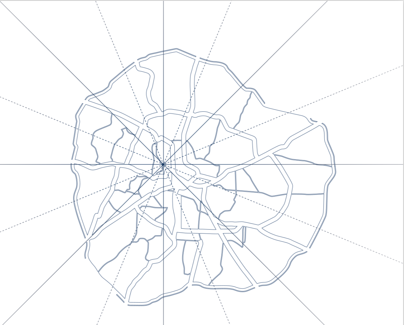
City Hotels Map Example
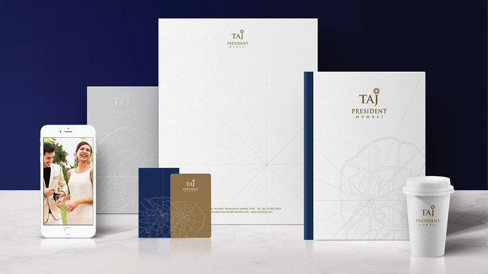
City Hotels Stationary
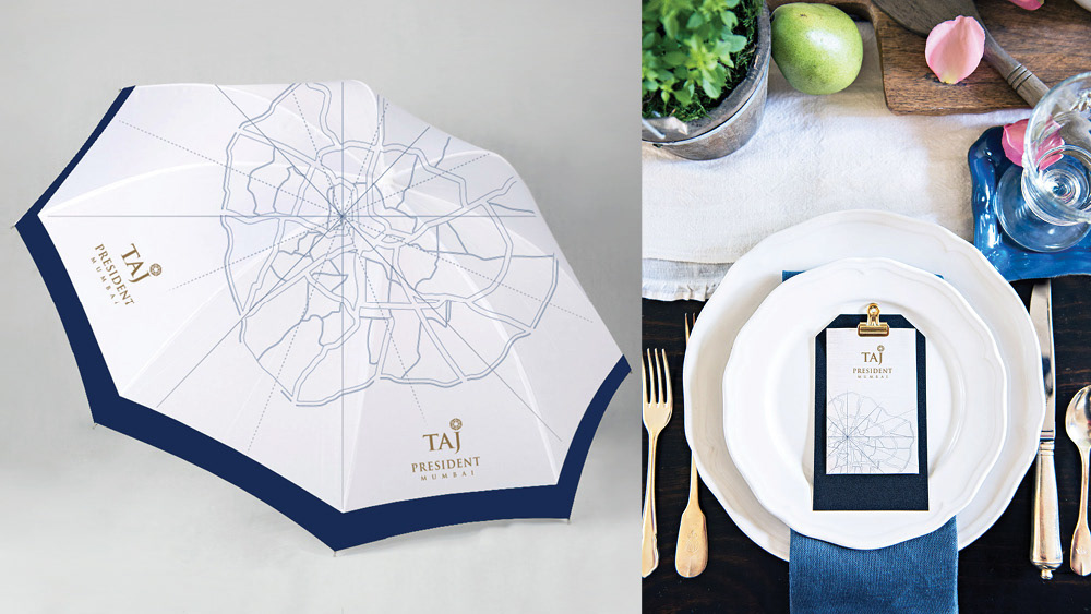
City Hotels Collateral
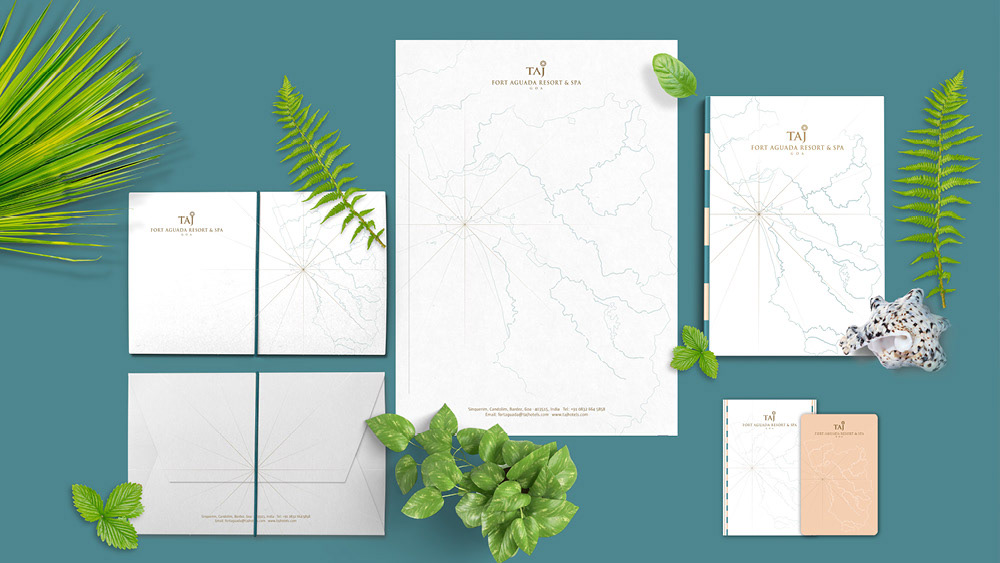
Resorts and Spas Stationary
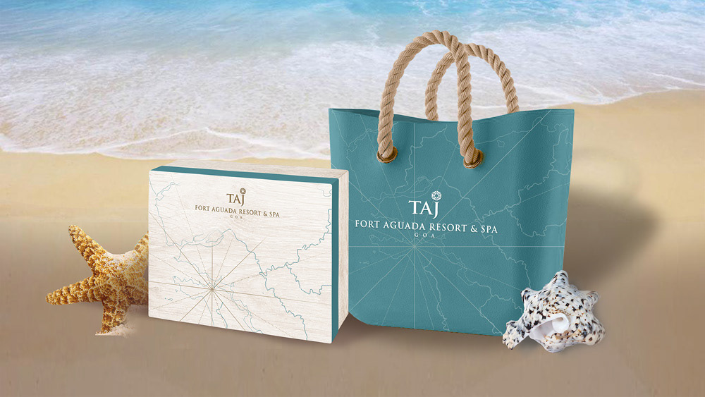
Resorts and Spas Gift Box and Tote

'Make Your Mark' Sandals for Resorts and Spas
THEME 2: Patterns Et. Al
For City Hotels, we opted for a sense of formality, speed, dynamism and efficiency visually represented through a simple linear pattern. This pattern has depth as it is not evenly spaced. It is flexible and allows for a unique design system across collaterals.
For the Resorts and Spas we used a pattern inspired by the waves of the ocean, the leaves of the trees, the calming zen patterns one can create with a rake in the sand... It’s an amalgamation of all things ‘leisure’ in a subtle, yet interesting pattern.
Theme 2 Inspiration: Patterns in Nature
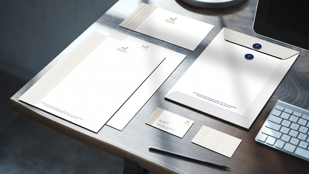
City Hotels Stationary
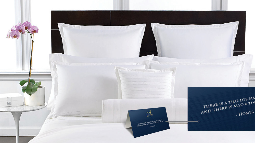
City Hotels Turn Down Card
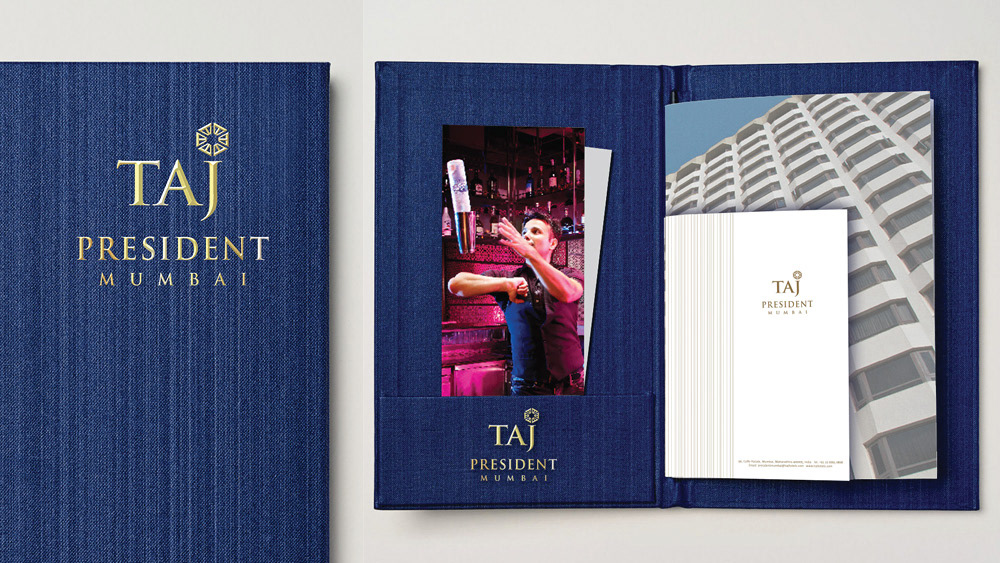
City Hotels In Room Dining Menu Card

Resorts and Spas Stationary
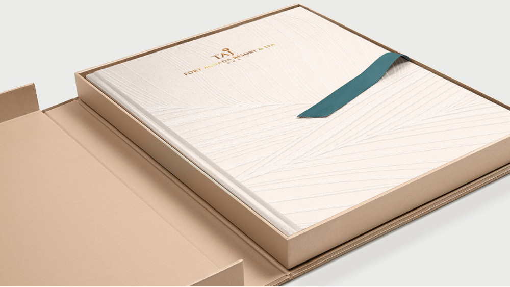
Resorts and Spas Brochure
