Brand strategy, identity and extension pitch for Reliance Foundation Youth Sports.
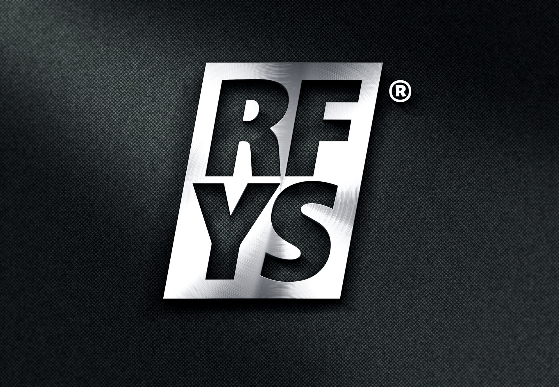
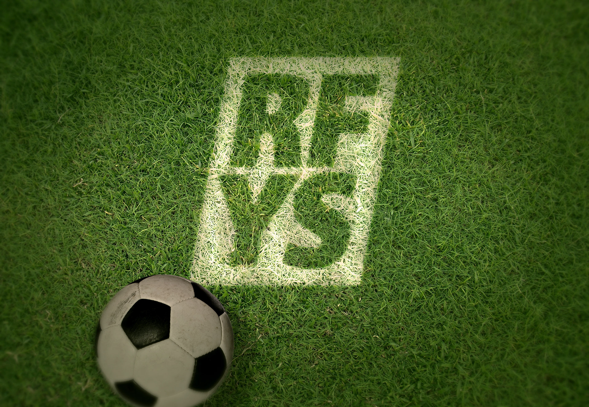
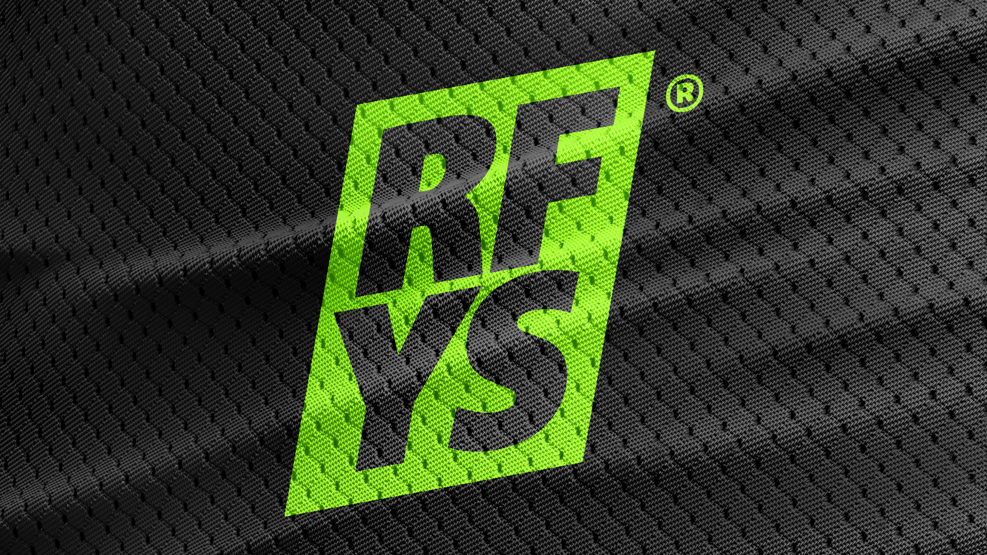
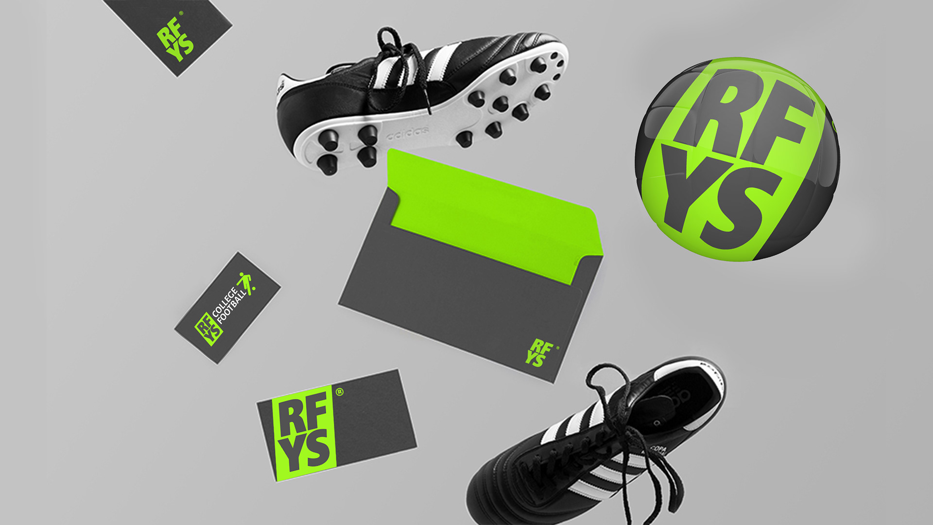
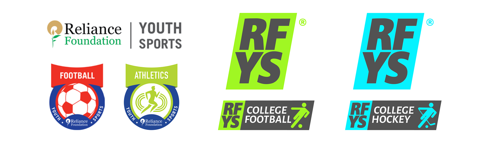
The existing logo features a mother brand that is vastly different from the sub-brands (sports specific). This concept looks at ways of simplifying the entire brand in a cohesive manner with an eventual goal of using the acronym RFYS so that it is easy to recall, reproduce and play around with.
As it is a brand focused in sports, the logo is angular which shows movement, precision and speed. The brand itself is simple enough to print or reproduce on uniforms, signage, stadiums, digital applications etc. Making this a future proof solution.